Simple Linear Regression in Python

Machine Learning Regression Algorithm in Python
What is Simple Linear Regression?
In statistics, simple linear regression is a linear regression model with a single explanatory variable. In simple linear regression, we predict scores on one variable based on results on another. The criteria variable Y is the variable we are predicting. Predictor variable X is the variable using which we are making our predictions. The prediction approach is known as simple regression as there is only one predictor variable,
As a result, a linear function that predicts the values of the dependent variable as a function of the independent variable is discovered for two-dimensional sample points with one independent variable and one dependent variable.
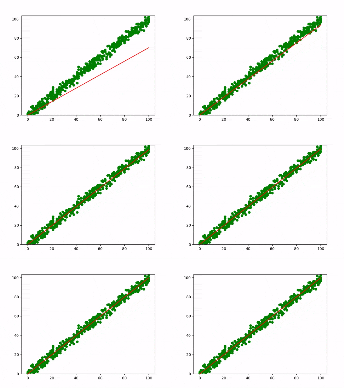
The below graph explains the Linear regression visually.
Equation : y = mx + c
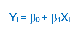
β0 (y-intercept) and β1 (slope) are the coefficients whose values represent the accuracy of predicted values with the actual values.
Implement Simple Linear Regression in Python
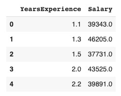
In this example, we will use the salary data concerning the experience of employees. In this dataset, we have two columns YearsExperience and Salary
-
Step 1: Import the required python packages
# Import libraries
import pandas as pd
import numpy as np
import matplotlib.pyplot as plt
import seaborn as sns
from sklearn.model_selection
import train_test_split
from pandas.core.common
import random_state
from sklearn.linear_model import LinearRegression
-
Step 2: Load the dataset
# Get dataset
df_sal = pd.read_csv('/content/Salary_Data.csv')
df_sal.head()
-
Step 3: Data analysis
Now that our data is ready, let’s analyze and understand its trend in detail. To do that we can first describe the data below –
# Describe data
df_sal.describe()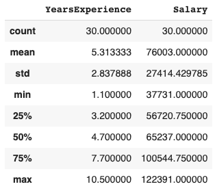
Here, we can see Salary ranges from 37731 to 122391 and a median of 65237.
We can also find how the data is distributed visually using the Seaborn distplot
# Data distribution
plt.title('Salary Distribution Plot')
sns.distplot(df_sal['Salary'])
plt.show()
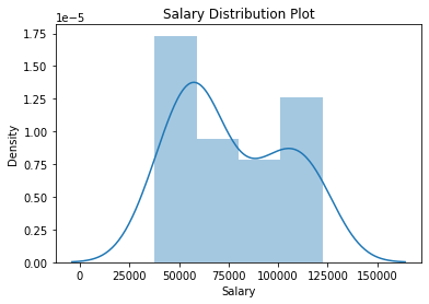
A distplot or distribution plot shows the variation in the data distribution. It represents the data by combining a line with a histogram.
Then we check the relationship between Salary and Experience –
# Relationship between Salary and Experience
plt.scatter(df_sal['YearsExperience'], df_sal['Salary'], color = 'lightcoral')
plt.title('Salary vs Experience')
plt.xlabel('Years of Experience')
plt.ylabel('Salary')
plt.box(False)
plt.show()
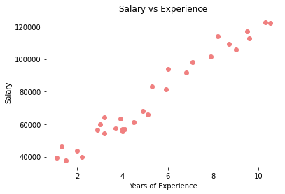
It is visible now, that our data varies linearly. That means, that an individual receives more Salary as they gain Experience.
-
Step 4: Split the dataset into dependent/independent variables
Experience (X) is the independent variable Salary (y) is dependent on experience
# Splitting variables
X = df_sal.iloc[:, :1] # independent
y = df_sal.iloc[:, 1:] # dependent
-
Step 5: Split data into Train/Test sets
Further, split your data into training (80%) and test (20%) sets using train_test_split
# Splitting dataset into test/train
X_train, X_test, y_train, y_test = train_test_split(X, y, test_size = 0.2, random_state = 0)
-
Step 6: Train the regression model
Pass the X_train and y_train data into the regressor model by regressor.fit to train the model with our training data.
# Regressor model
regressor = LinearRegression()
regressor.fit(X_train, y_train)
-
Step 7: Predict the result
# Prediction result
y_pred_test = regressor.predict(X_test) # predicted value of y_test
y_pred_train = regressor.predict(X_train) # predicted value of y_train
-
Step 8: Plot the training and test results
It is time to test our predicted results by plotting graphs
- Plot training set data vs predictions First we plot the result of training sets (X_train, y_train) with X_train and predicted value of y_train (regressor.predict(X_train))
# Prediction on training set
plt.scatter(X_train, y_train, color = 'lightcoral')
plt.plot(X_train, y_pred_train, color = 'firebrick')
plt.title('Salary vs Experience (Training Set)')
plt.xlabel('Years of Experience')
plt.ylabel('Salary')
plt.legend(['X_train/Pred(y_test)', 'X_train/y_train'], title = 'Sal/Exp', loc='best', facecolor='white')
plt.box(False)
plt.show()

- Plot test set data vs predictions Secondly, we plot the result of test sets (X_test, y_test) with X_train and predicted value of y_train (regressor.predict(X_train))
# Prediction on test set
plt.scatter(X_test, y_test, color = 'lightcoral')
plt.plot(X_train, y_pred_train, color = 'firebrick')
plt.title('Salary vs Experience (Test Set)')
plt.xlabel('Years of Experience')
plt.ylabel('Salary')
plt.legend(['X_train/Pred(y_test)', 'X_train/y_train'], title = 'Sal/Exp', loc='best', facecolor='white')
plt.box(False)
plt.show()
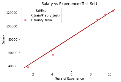
We can see, in both plots, that the regressor line covers train and test data.
Also, you can plot results with the predicted value of y_test (regressor. predict(X_test)) but the regression line would remain the same as it is generated from the unique equation of linear regression with the same training data.
If you remember from the beginning of this article, we discussed the linear equation y = mx + c, we can also get the c (y-intercept) and m (slope/coefficient) from the regressor model.
# Regressor coefficients and intercept
print(f'Coefficient: {regressor.coef_}')
print(f'Intercept: {regressor.intercept_}')

Conclusion
I hope this post served as a good introduction to Simple Linear Regression and why it is important to create and assess linear models. In simple terms, linear regression is a potent supervised machine learning approach that enables us to predict linear correlations between two variables.

